Getting started
Requesting access
If you are a Washington Post employee, please submit a SAR to gain access to your Figma Product & Design workspace. If you are not a post employee and are looking to use WPDS Ui Kit, please reference these Figma files. WPDS Ui Kit & WPDS Asset Manager.
Prerequisite
Before jumping into Figma and using our design system, you must first understand the concepts around our system. The Figma library is built and designed to parallel what is happening in the code. Please read over the following before proceeding with this guide.
Using components
Enabling our Figma libraries
When using our Figma library, it is essential not to detach as this will give you the optimal experience when handing off designs to a developer.
Component variants
All of our components match the coded API (properties of the variants) as close as possible.
Slots
Some of our components use a concept called slots. Slots are for you to replace with your component or nest another component. To replace, select the slot in the layer and replace it with the desired component. You can build out a design that does not need to be detached by replacing slots.
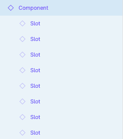
This example shows available slots to replace with other local or design system components
Icons
If an icon layer of a component is locked, this indicates that you should not change the icon. Otherwise, you may modify the icon glyph using any icon available in our Asset Manager.
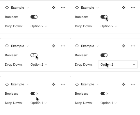
Use Figma variant controls
Only use the Figma variant controls when modifying the Figma component to apply the desired variant. These controls closely match to the coded component and inform the developer on what property value to assign. Avoid manually overriding the properties by selecting the layers.
Using our tokens
Applying tokens
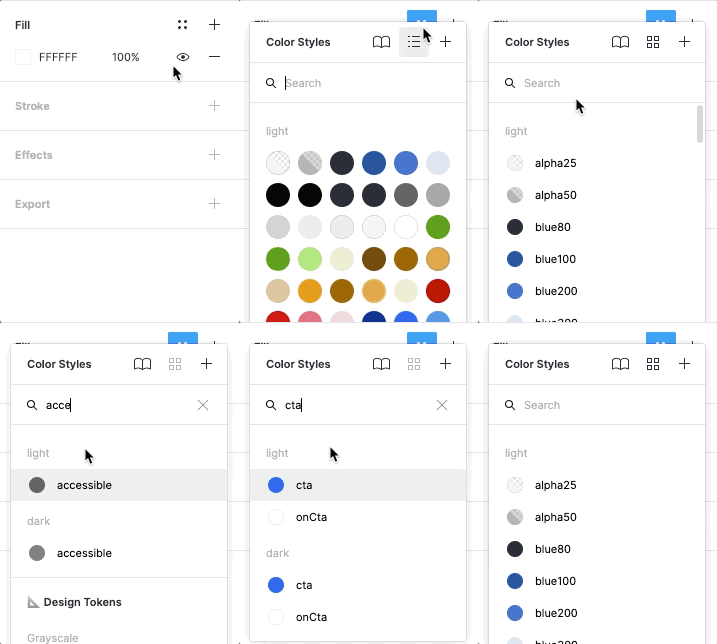
In Figma, we have two tokens managed by the native Figma UI. The shadow and color tokens can be accessed by selecting the style icon. All other tokens are handled either through our token tools or manually.
Applying color
Select the style icon and apply the fill or stroke color to apply a color token in Figma. When selecting a color style, all tokens are displayed; a helpful way of picking the right colors is to use our theme alias to assign color with intention.
Applying shadows
To apply shadows to an element, select the effects in the design panel and apply one of the shadow tokens.

Applying other tokens
We developed a plugin to manage and assign tokens in Figma that are currently not supported or flexible enough to be used in design without detaching the style. Our plugin resolves this by connecting our tokens while still being flexible in Figma.
Installing Token Tools
To install the plugin, visit the plugin landing page and install. You will now have access to the plugin in your Figma file. If you do not see the plugin, please reload the file.
Token tools
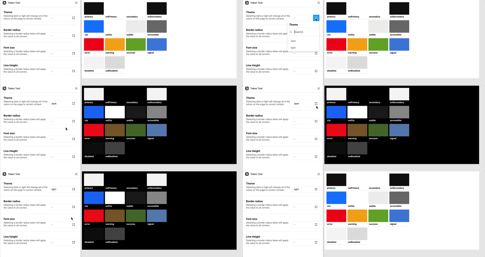
Token Tools is a plugin that we will iterate and expand on as our needs grow with the system. The interface design mimics Figma UI to avoid learning new interaction patterns.

Theme
The theme tool in token tools applies the matching color for that theme switching it from its current context to the following context.
Border radius
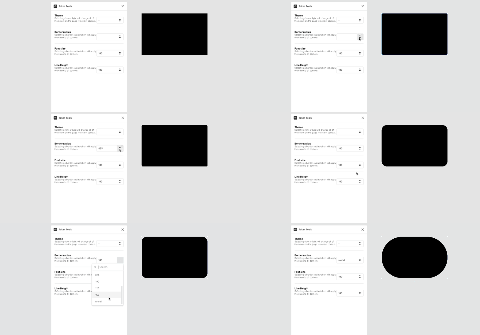
Using the border radius tool will apply the border radius token to any frame or shape that has a uniform border radius.
Font size & Line height
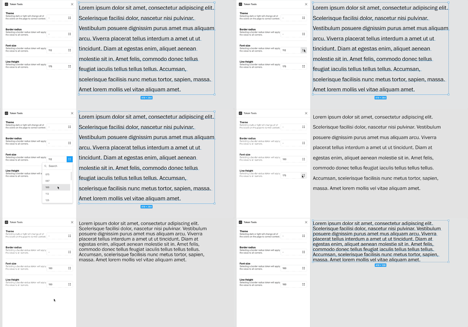
The font size and line height tool will apply the token to the selected text element.
Font weight & Font Family
Currently, token tools do not manage font family or font weight. However, in the WPDS Zeplin extension, the extension will note the tokens. For more information, please refer to our tokens documentation to apply the correct value in Figma.